Unravelling Flex-Box
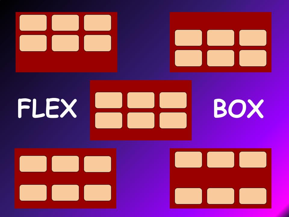
Flexbox can be overwhelming but a deep understanding makes it handy for making designing web pages faster.
Imagine four elements present in a webpage. These elements are in a vertical top to bottom design in an HTML structure. As a CSS designer, everyone has trouble aligning them in a horizontal position let's say in a Navigation Bar.
Any page in a web browser has two axes: The main axis and a cross axis. For elements placed on the main axis, you want to shift it into a cross axis. Difficult right?
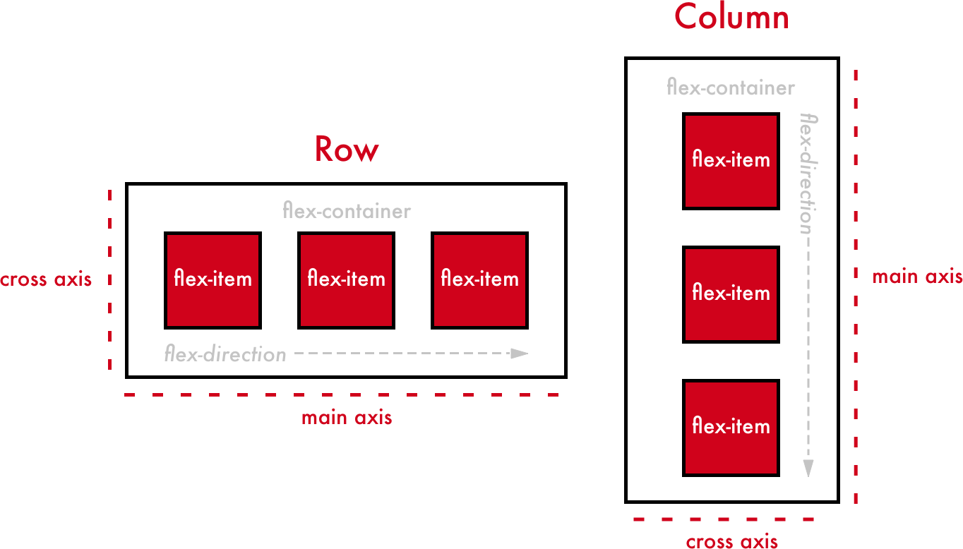
Enter, FLEX-BOX the new display method, that allows you to do quick work of it.
Flex is applied on the parent container to align the child elements in the direction you want.
For example: Look at the following snippet of code.
<!DOCTYPE html>
<html lang="en">
<head>
    <meta charset="UTF-8">
    <meta http-equiv="X-UA-Compatible" content="IE=edge">
    <meta name="viewport" content="width=device-width, initial-scale=1.0">
    <title>Document</title>
    <style>
        .parent{
            background-color: purple;
        }
    </style>
</head>
<body>
    <div class="parent">
        <div class="obj1"><img src="https://learnyst-user-assets.s3.ap-south-1.amazonaws.com/school-assets/schools/2410/schoolLogo/1657573685244Custom%20Size%20%E2%80%93%201.png" alt="logo1" height="10%" width="10%"></div>
        <div class="obj2"><img src="https://learnyst-user-assets.s3.ap-south-1.amazonaws.com/school-assets/schools/2410/schoolLogo/1657573685244Custom%20Size%20%E2%80%93%201.png" alt="logo1" height="10%" width="10%"></div>
        <div class="obj3"><img src="https://learnyst-user-assets.s3.ap-south-1.amazonaws.com/school-assets/schools/2410/schoolLogo/1657573685244Custom%20Size%20%E2%80%93%201.png" alt="logo1" height="10%" width="10%"></div>
    </div>
</body>
</html>
which gives out the following output...
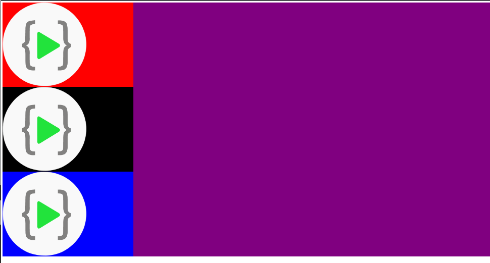
To align these items on the main axis, all you need to do is apply flex.
   <style>
        .parent{
            background-color: purple;
            display: flex;
        }
    </style>

Fairly easy. Flexallows you to change the directions of elements easily inside an HTML structure.
Certain facts about FLEX
Flex allows you to change the orientations of elements:
1. Flex-direction: Row;
 It's a default direction but anyhow if you want you can change what you want.
2. Flex-direction: Row-reverse;
 Allows you to reverse the positions of elements in a row but in reverse order.
3. Flex-direction: Column;
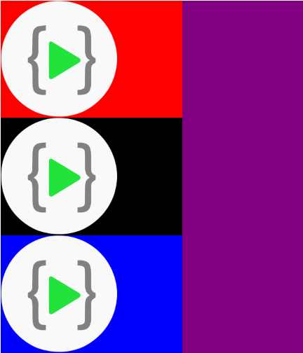 Allows you to place the elements in a column direction.
4. Flex-direction: Column-reverse;
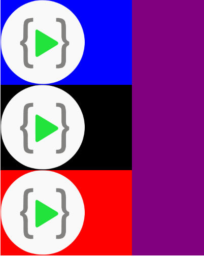 Allows you to reverse the positions of elements in a column but in reverse order.
Explore more about flex to design websites in an interesting way. Keep learning.